Renko Charts: How Can You Use Them in Trading?
Charts are an essential part of trading, as they display information that helps an individual decide if it is a good or bad moment to enter or exit a position. There are many chart types, and the most popular ones include line charts, bar charts, and candlestick charts. But this article is dedicated to Renko charts – not so widely spread but, still, very useful. Read further to dive deeper into the notion.
What Are Renko Charts?
A Renko chart is a kind of chart created in Japan and is built based on the price change of a set value ignoring time frames. It makes this chart different from most other charts, which use both price and particular time intervals – like a minute, hour, week, and so on.
The Renko chart got its name from the Japanese word “renga,” which means “bricks” and really looks like a consequence of bricks. A new brick is formed only when the price changes by a specified amount, and then a new Renko bar is placed at a 45-degree angle — either above or below the prior brick depending on the direction of the price movement. If the price goes up, the bricks are painted green or white, while a downtrend is colored red or black.
Bricks have different times of formation depending on how much time it takes the price to change for a predetermined size. Such an approach helps traders get rid of unnecessary noise and gives them a clearer understanding of the current market trend.
A brick can be composed of any price size like $0.5, $10, and so on, which is known as the box size.
Example of Using Renko Charts
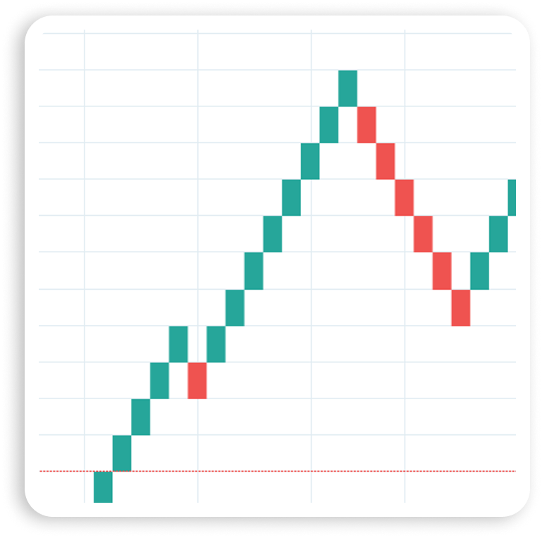
This Renko chart shows a strong uptrend in a security with a particular box size. Renko bars are created based on closing prices – both highs and lows – and all the changes smaller than the set box size are just ignored. We see a short pullback (a single red brick) in the middle of the trend. Taking into consideration the strong bullish trend, this red brick can be a good opportunity to enter long. The exit point can be the moment when two red bricks appear.
Once the uptrend is over, a downtrend begins. This moment of time can be captured to enter short. Sometimes it is necessary to wait for a small pullback – a single green box – to enter the continuing downtrend. The exit point usually coincides with new green bricks (there should be at least two bricks).
These are just examples of what can happen. Renko price charts may be quite useful when you need to have a clear picture of the current trend, but they won’t help to predict the forthcoming trends.
How Do Renko Charts Work in Trading?
Renko charts ignore small price movements, which makes them convenient tools for highlighting trends and reversals. It’s easy to determine support and resistance areas and breakouts. Such simplicity makes it easier to notice buy and sell signals, which are sent to the trader when the brick color changes from bullish to bearish or vice versa. But it is strongly recommended to use Renko charts together with some other analytical tools, technical indicators, and chart patterns to prove the trading decision right or wrong and to avoid unnecessary losses. A situation in which a strong trend is interrupted just by one brick of the opposite color is quite common. It increases the risk of closing a profitable position earlier or opening it in the wrong direction. This makes signal confirmation a must.
Renko vs. Heikin Ashi
Heikin Ashi charts have some features in common with traditional candlestick charts. The former kind is an averaged version of the latter, which needs data from the previous bar to form the following candle’s opening price. Heikin Ashi candles are formed every period (depending on the time frame), whereas, with Renko, a new brick is created only when the price changes by a certain amount.
Such a visualization makes the Heikin Ashi chart look smoother and makes trends and reversals easier to spot. But at the same time, there are some gaps, as price data is lost because of averaging. This can be a source of risk.
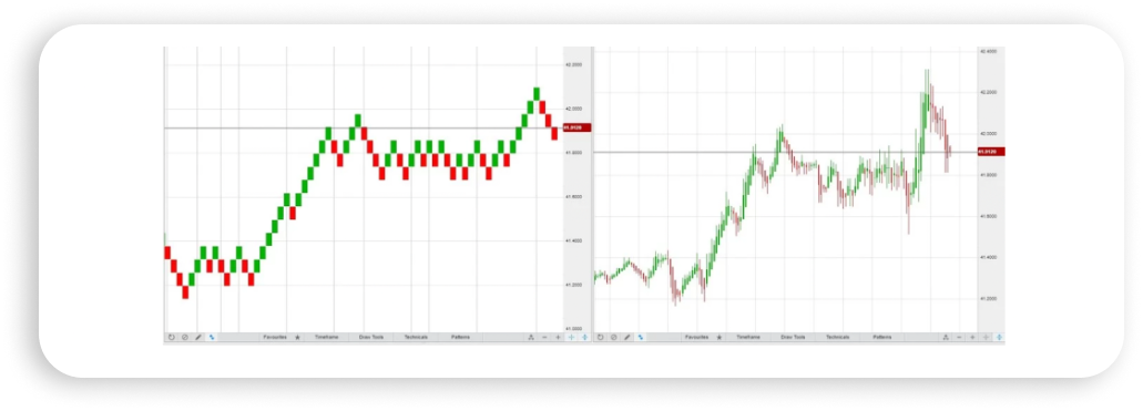
A Heikin Ashi chart looks different from a Renko one:
Renko Charts vs. Candlestick Charts
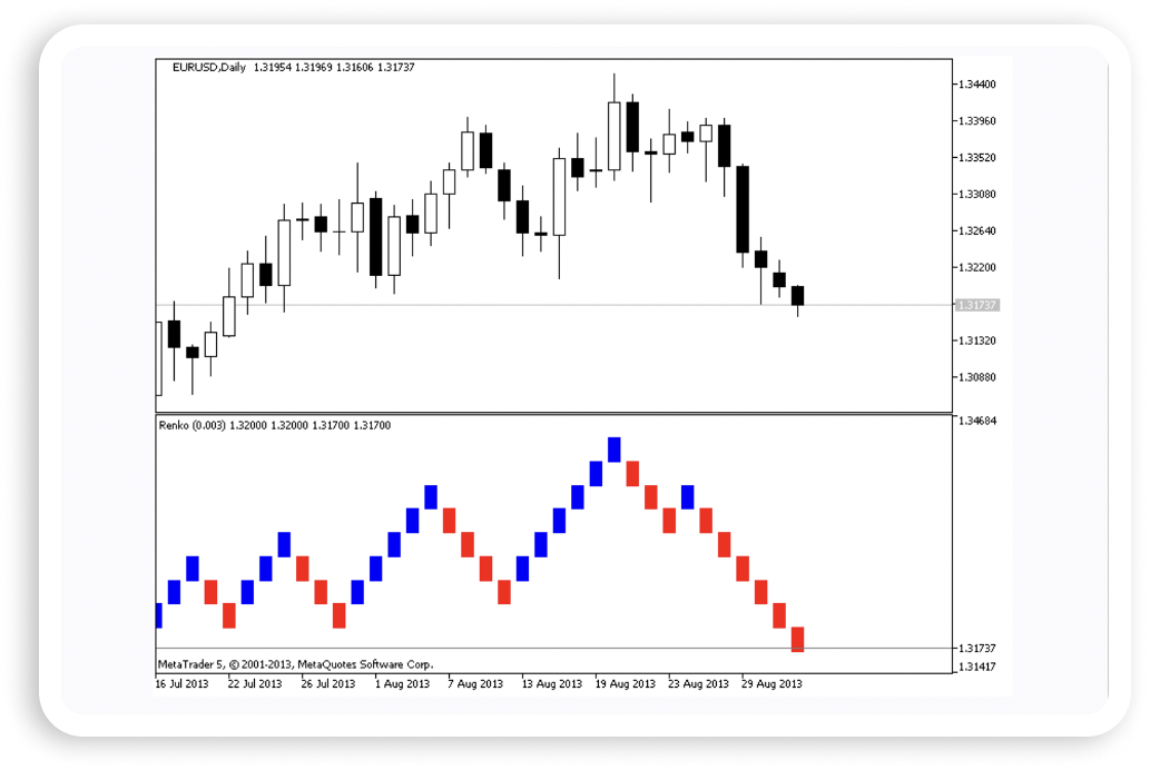
Standard candlestick charts are more concentrated on timeframes and small price movements compared to Renko charts. A new candle is formed every time interval without taking into consideration how far the price goes. If we take an interval of one hour and assume that at least one transaction took place, a candle will form, and we’ll see open, close, high, and low prices.
Renko charts don’t show these parameters on each trading time interval, and new bricks are not formed if the price doesn’t move by the predetermined size. It makes candlestick charts look different.
What Are the Advantages of Using Renko Charts?
Renko charts are not the most popular type, but they have their own useful features.
- Small price movements are not taken into consideration, making the chart look clean without any unnecessary noise.
- Visualization of Renko charts is appealing due to their simple representation and addition of color. It also makes them easy to interpret.
- Support and resistance levels are easier to identify.
- The chart can be used for trailing stop-loss in trend trading.
- The price direction can be identified by the most recent brick color.
- A price reversal can be easily identified by two bricks moving in the opposite direction.
What Are the Limitations of Using Renko Charts?
Renko charts have some disadvantages too. The main ones include the following.
- Renko charts can be choppy, which makes the price direction rather vague. When the trading asset is choppy, the chart is usually choppy too.
- Informational noise can be sometimes useful, too. Closing and opening prices and highs/lows are not visible when the trader is working with Renko charts.
- The most relevant chart analysis can be usually applied to the past data. The same can be said about an optimal brick size. A Renko brick-size calculator may not be perfect for future price predictions.
How to Read Renko Trading Chart
Reading a Renko chart is not a difficult task. All the bricks have a fixed size, which makes them easy to compare with each other. The location and/or color of the brick changes every time the price of the previous brick exceeds a particular amount. A change of color is an indication to traders that the trend is about to change and the price will start moving in the opposite direction.
A brick’s size depends on the trading objectives and strategies. Traders who open and hold longer depositions choose bigger brick sizes compared to traders who speculate during short time frames. The choice of the brick size defines how “smooth” the chart will look. If it is small, more swings will be created. In this case, it will be easier to predict possible price reversals. If the brick is big, the number of swings will be reduced together with the noise, but price reversals will be more difficult to identify.
How To Use Renko Charts
Renko chart analyses provide traders with the same trading signals as other charts.
Levels of Support and Resistance
The situation when the price goes back after reaching a certain level is quite common. If this level is higher than the price, it is known as the resistance level; if this level is lower than the price, it becomes the support level.
This type of signal appears regularly on different timeframes and is rather popular among those who trade on Renko charts.
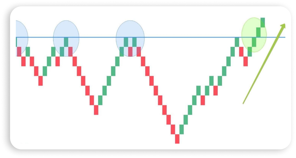
This chart demonstrates the resistance level that coincides with local highs: the price stopped several times at the same mark and then moved backward.
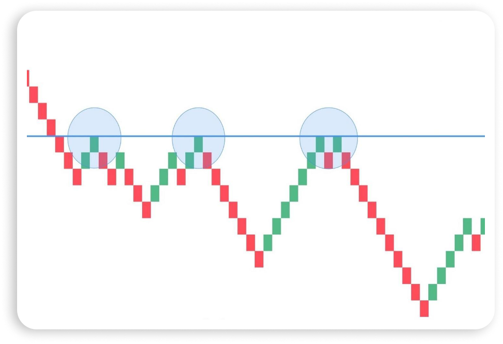
Renko charts help to find the resistance and support levels much easier, as the volatility is depicted much smoother. In a perfect trading world, this level lies on two tops and is later confirmed by the third one. In order to locate the support level, you have to act in the same way with only one difference – it is necessary to look for two bottoms.
Breakouts
A breakout comes from the understanding of support and resistance levels and happens when one of them is broken. In this situation, the trend is likely to move either upwards when the resistance is broken or downwards in the case of a broken support level.
The following example demonstrates how a breakout looks on the Renko chart. In this case, many traders open long positions in the green oval, as they are expecting the trend to gain pace and continue.
Overbought & Oversold
Traders find themselves in an overbought market when most of them have opened long positions. Oversold markets can be found in a situation when most of the traders are in short positions, which leads to a large imbalance toward the bearish trend. Both overbought and oversold conditions are powerful signals that the market is about to reverse and start moving in the opposite direction. Despite the probability of the trend’s movement by inertia, it is not very likely that a significant price shift will occur.
Renko charts display price movement in a particular way that doesn’t help to see the overbought and oversold situations clearly. However, they can be discovered indirectly, when the movement doesn’t correct even if the trend duration was rather long.
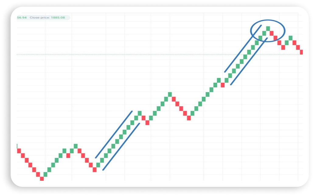
This chart depicts the described situation: the last wave of the trend looks exactly the same as the wave at its beginning. Comparing the two of them, we can predict the location of the possible trend reversal.
You can also use oscillators that determine overbought and oversold areas. These are the Relative Strength Index (RSI), Stochastic Oscillator, and MACD.
Fibonacci Levels
A Renko chart can be assessed with the help of Fibonacci levels.
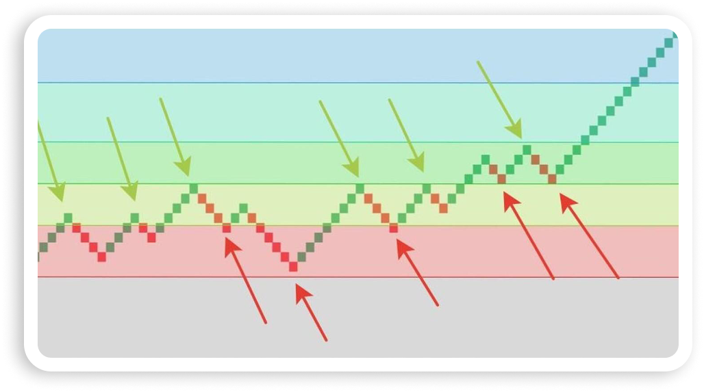
This is an example of the Fibonacci levels. The arrows show the local maximum and minimum levels where the chart touches the Fibonacci levels.
The accuracy of these touches is increased because of smoothing. As a result, resistance and support levels are clearly visualized, which is a confirming indicator for those who use channel trading and trading on breakouts.
Renko Charts and Graphic Patterns
Graphic patterns are widely used in technical analysis. There are several of them that are very easy to see on Renko charts.
Head and shoulders is a reversal pattern consisting of two lower tops (shoulders) and a higher one in between them, which is a local high. All the positions should be opened from the “neck” – local lows. These lows are not always on the same level, but the good thing about Renko charts is that this pattern is easily identified, as there is no unnecessary market noise.
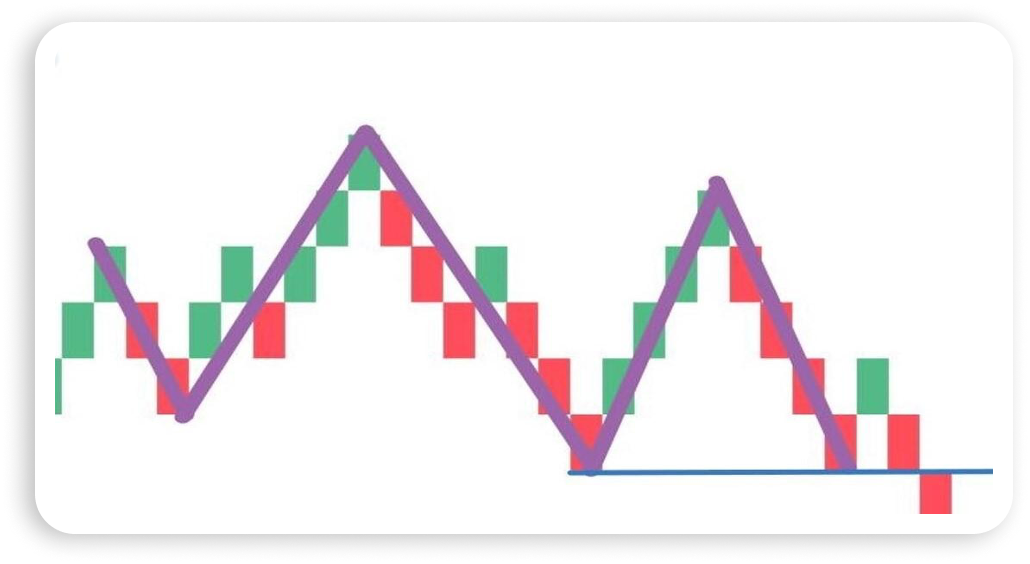
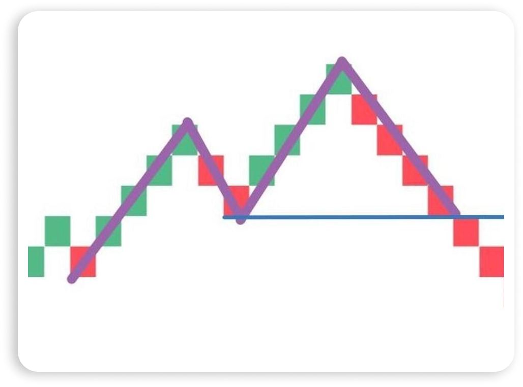
A double top appears after a long growth. This figure can be seen when the resistance level is tested by the price, which forms a local high. It’s recommended to open a sell position when the price crosses the neckline after the second top.
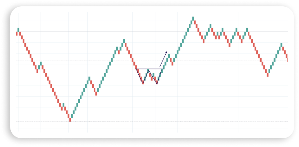
A double bottom is a pattern that is similar to the double top, but it occurs after a bearish trend. It is also a reversal pattern, and a long position should be opened when the price starts to go up and reaches the correction endpoint (black line).
How To Calculate Renko Charts
The new brick is formed when the change in the asset price exceeds the size of the brick. This size can be calculated in three common ways:
- By Percentage of the Value
In this method, the brick is measured as a particular percentage of the asset’s current value. The most typical range is from 0.25% to 1%. If you choose to use the lower value, the bricks will be formed more often. This will lead to less noticeable smoothing. In the case of bigger values, the smoothing will increase thanks to less frequent brick formation.
- By Average True Range (ATR)
This method shows how much the value of the asset has changed over a particular time frame. In other words, it shows the asset’s volatility.
In order to calculate the ATR, it is necessary to calculate the moving average (MA) of the largest among the modules of the following three values: the differences between the local extremum, between the high and closing price, and between the low and closing price. The MA period is set in the settings, and the calculator then computes the ATR value in the usual chart and allocates it to the size of the brick.
The ATR method gives an opportunity to get rid of all the unnecessary noise and concentrate only on the important movements, regardless of the volatility.
- By a Static Box Size Value
This method implies that the box size value is constant and manually determined by the trader as a particular number of points.
Renko Chart Strategies
Most of the strategies that were created for the Japanese candlestick charts can be applied to Renko too. Moreover, they can be applied to various markets, including Forex, commodities, and stocks. Here are some of them.
Trendline Breakout
One of the most popular and effective strategies is trading on a trend breakout. It is necessary to draw a trend line based on extreme points and wait for its breakouts. The difference between trading within a bullish and bearish trend is that the line is drawn on local lows in the case of the former and on the highs when it comes to the latter.
A trendline breakout usually indicates the reversal and start of a movement in the opposite direction. To make the forecast more accurate, you need to use a confirmation bar – the next brick after the breakout bar that goes in the same direction as the previous one.

Support and Resistance Breakout Strategy
This strategy is similar to the one described above, but it is based on horizontal support and resistance levels. Here is an example demonstrating how to build the resistance level.

The support and resistance levels are set based on their matching to highs and lows. They look like some kind of obstacle that holds back the bricks when they come closer. The chart above shows the resistance level, which is depicted as a black line, and the circles represent the places when the growth stopped. The matches are not perfect here, but it is a permissible error.

Once the resistance level is determined, it is necessary to wait for the brick to break above the resistance level. The formation of the second bar moving in the same direction as the predicted trend can be good confirmation. It is a blue arrow in the chart above, and you can open a long position. The red line is a stop loss, which is located a few bricks below.
As the trend develops, we are waiting for the appearance of reversal signals in order to take profit. It is a double top figure in our case.
Renko Swing Trading
Renko charts can be a useful tool for swing traders who aim to capture trends and who don’t close their positions till the total reversal. A situation in which the price is increasing and only the green bricks continue to form is not rare at all. The swing trader is waiting for the reversal of a particular predetermined size in order to exit the deal.
Potential trade triggers on Renko charts include breakouts above resistance and below support levels. If the price stops at the resistance level, the short position can be initiated and held until it drops to the support level. The same strategy can be applied to taking long near the support level.
Renko Chart Scalping
A scalping strategy aims to get profit several times a day from small price movements. As the Renko chart is built based on price movements, indicates overall trend direction, and ignores timeframes, the data is not always provided in due time. It makes Renko charts not the best choice for the scalping strategy.
Tips for Using Renko Charts
One of the most common questions concerning trading on financial markets is how to trade successfully. Unfortunately, there is no one-fits-all strategy that guarantees success, but there are some tips that may increase your chances of gaining profit.
- A careful choice of a trend is a must.
- The Renko brick size is of the utmost importance.
- The right choice of trading platform is crucial.
- Patience, financial management, and risk assessment are the key factors.
Conclusion
A Renko chart is a type of chart that is based on the price change without paying much attention to the time frames. It makes this chart suitable for those who need to see clear trends without informational noise. Its clear picture, in turn, gives a perfect opportunity to see graphic patterns, resistance and support levels, trend lines, and other crucial elements of any trading strategy.


